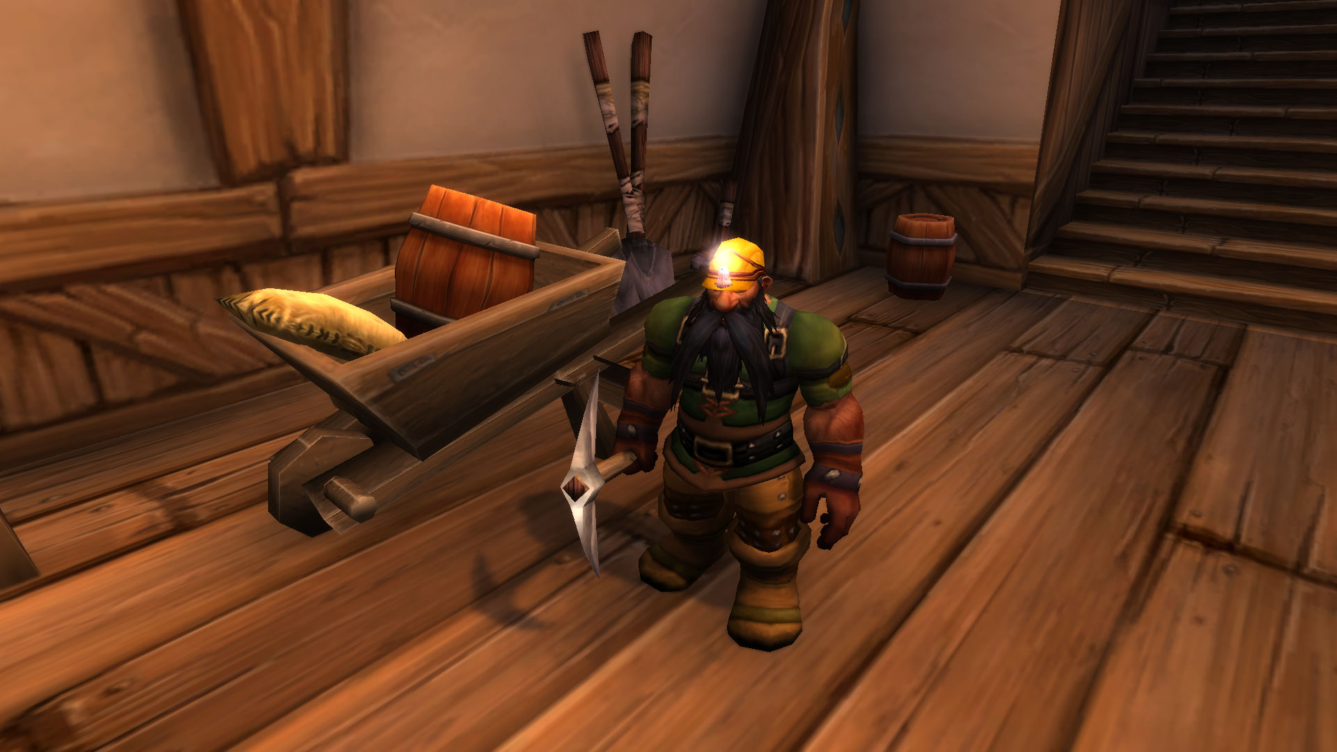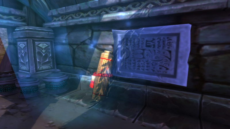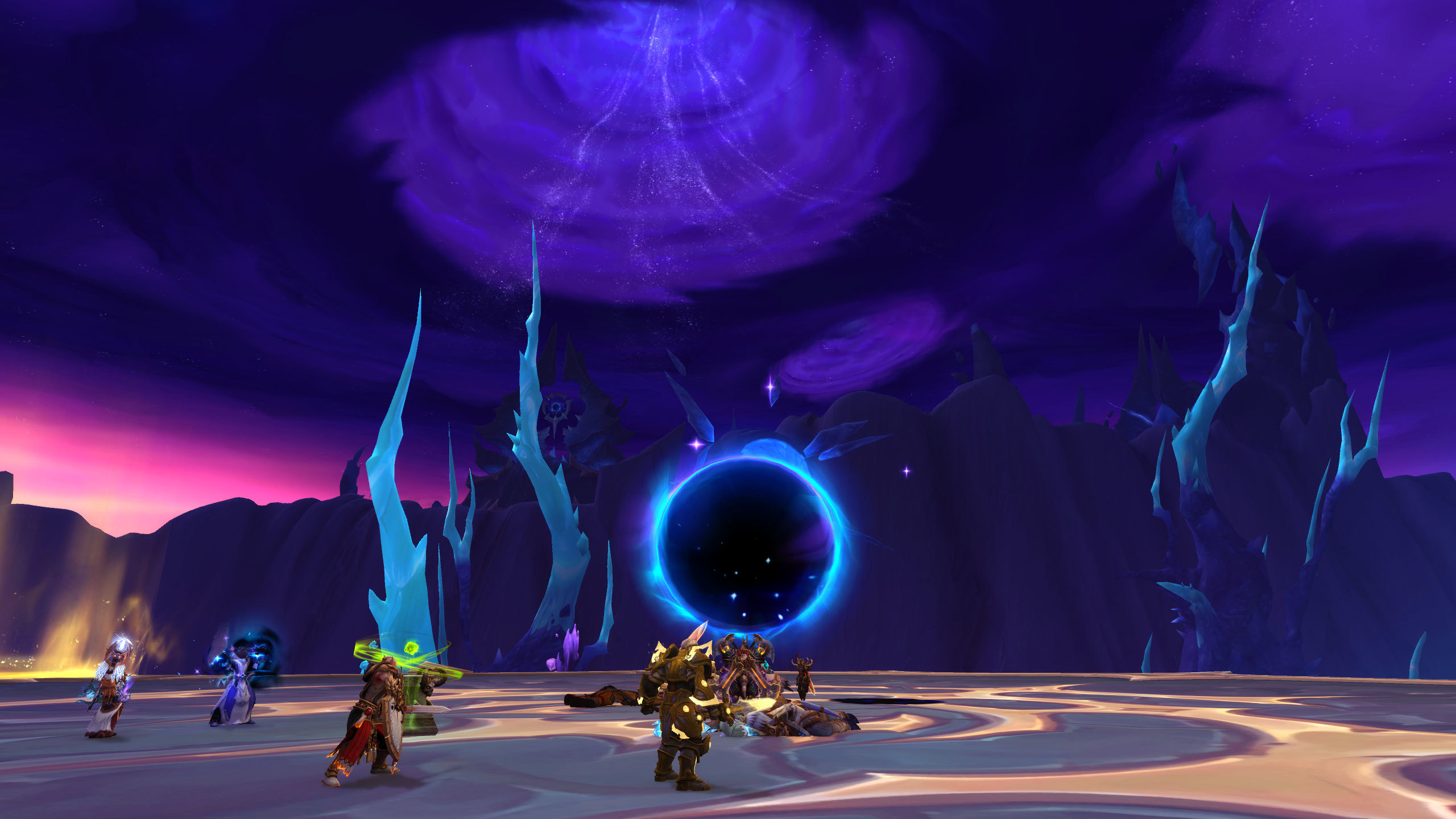

World of Warcraft possesses a distinct visual identity that separates it from every other modern title. While other developers chase hyper-realism and complex lighting engines, Blizzard built a world on stylized proportions, bold color choices, and exaggerated forms. This aesthetic is the primary reason the game remains visually pleasing two decades after its initial release. This guide examines the core pillars of the Warcraft art style, breaking down the design choices that ensure the game ages like fine art rather than fading alongside outdated technology.
The Power of Stylization Over Realism
The foundation of the Warcraft art style is the rejection of photorealism. By using hand-painted textures and oversized silhouettes, the developers created an environment that feels like a living painting. Humanoid characters feature broad shoulders, massive hands, and distinct facial features that remain readable even from a distance. This approach ensures that the game does not fall into the uncanny valley, a common trap for titles that attempt to mimic real-world lighting and textures too closely.
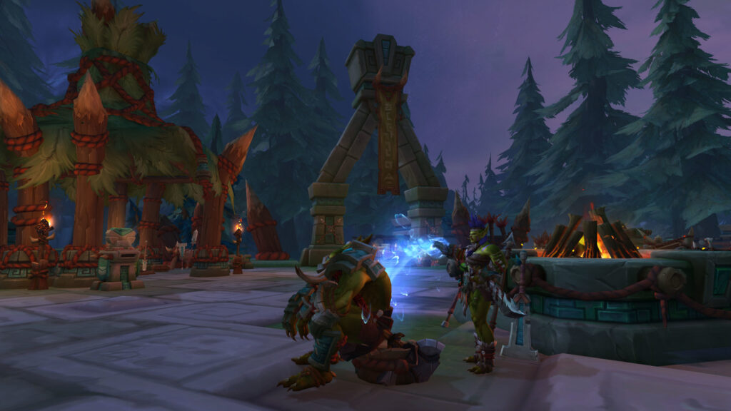
Color serves as the most important tool for visual clarity. Every zone uses a specific, saturated palette that dictates the mood before a player even interacts with an object. Lush forests in Elwynn use deep greens and bright golds, while the Blasted Lands utilize rusted oranges and crimsons. These bold, high-contrast colors allow the game to remain vibrant and clear, regardless of the hardware it runs on. The focus is always on readability, ensuring that players can identify enemies, allies, and interactable objects at a single glance.
Consistency Through Design Elements
| Design Element | Visual Impact | Longevity Benefit |
|---|---|---|
| Hand-Painted Textures | Gives surfaces a soft, classic appeal. | Does not age as harshly as photo-textures. |
| Exaggerated Proportions | Ensures characters stand out against backgrounds. | Maintains visual hierarchy in busy scenes. |
| Saturation & Contrast | Creates distinct emotional zones. | Keeps the world feeling vibrant and alive. |
| Iconic Silhouettes | Makes gear and architecture instantly recognizable. | Builds a strong, timeless brand identity. |
Evolution Without Losing Identity
Modern updates to character models and environmental geometry have significantly improved fidelity, but the core style remains untouched. By layering high-definition assets over the original artistic foundation, the game manages to look modern while preserving the charm of the original release. This careful balance ensures that the player experience feels current while maintaining the spirit of the early game. It is a masterclass in visual heritage, proving that art direction will always triumph over raw technical power.
The Enduring Appeal of the Warcraft Aesthetic
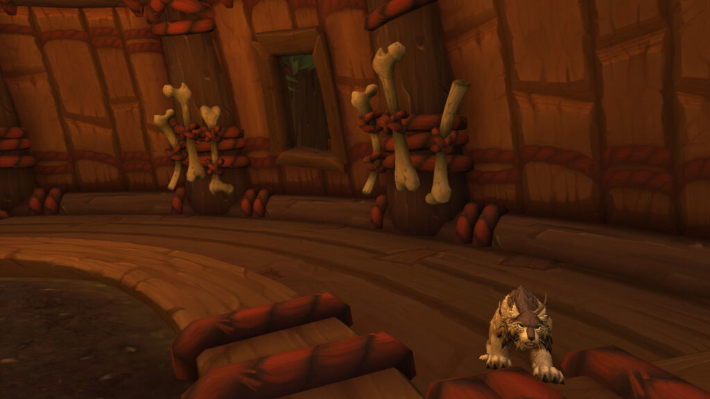
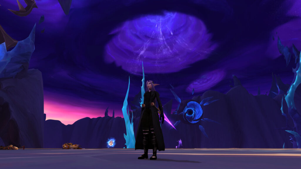
Ultimately, the art style succeeds because it feels intentional. Every spire, blade, and piece of armor is designed with a specific shape language that says something about its place in the world. Because the look is so cohesive, the game feels like a complete vision rather than a collection of assets. This unity is why players find the world comfortable and familiar, even when exploring new, alien environments. The style is not just a graphics choice; it is the visual soul of the franchise.